
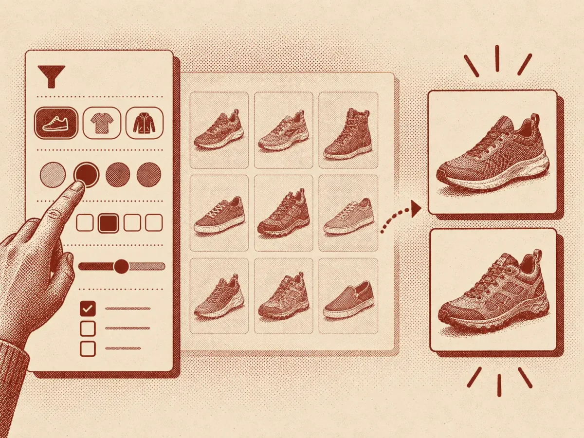
Faceted search filters exist to help shoppers narrow large product lists quickly, but many ecommerce sites implement them poorly, contributing to abandonment. Common shortcomings include generic filter sets that miss category-specific attributes, lack of multi-select options, jargon-heavy labels, page reloads on selection, and dead-end zero-result combinations, all of which erode customer trust in the filtering system.
The piece outlines practical fixes: offering attribute-specific filters, enabling multiple selections, using customer-friendly language, updating results in place, hiding unavailable options, designing mobile filtering separately from desktop, and showing removable filter chips. It cites Baymard Institute research showing significant differences in abandonment rates between mediocre and well-optimized filtering experiences, and provides a checklist for evaluating a site’s own filters.
Faceted search, the filter sidebar sitting on almost every category page, exists to do one job: narrow a list of hundreds of products down to the handful someone actually wants, without making them learn how the catalogue is organised behind the scenes.
Most sites get part of this right and enough of it wrong that customers give up before they find what they came for. Baymard’s benchmarking of major ecommerce sites found that 34% have filtering implementations poor enough to make narrowing down a list almost impossible. (baymard.com) That gap between what filters could do and what most of them actually do is where the easy wins sit, and none of the fixes below require rebuilding the catalogue from scratch.
Offer the filters customers already search by
Price is the filter almost every shopper reaches for first, whatever else they came to browse. Baymard’s mobile testing found that 80% of users tried to filter by price regardless of product type, and 88% of benchmarked sites already offer one, so this part is close to solved. (baymard.com)
The harder gap is category-specific: size for shoes, material for furniture, battery life for electronics. A generic set of brand and price filters copied across every category misses the exact attributes a shopper is actually trying to narrow by, and a customer who cannot filter by the one thing they care about will assume the store does not stock what they want.
Let people select more than one value at once
Someone shopping for a jacket in either grey or navy should be able to tick both, not run the same search twice. Fifteen percent of sites still do not allow multiple selections within one filter type, according to Baymard’s testing, which turns a two-second choice into two separate visits to the same page. (baymard.com)
Multi-select matters most on attributes where a real shopper genuinely wants several options open at once: colour, size, brand. Forcing a single choice makes someone commit to a decision before they are ready to.
Speak the customer’s language, not your warehouse’s
A filter only works if its label means something to the person reading it, not just to whoever built the product database. “Running shoes” means more to a shopper than “Category 14B”, and a filter labelled “Waterproof” gets used far more than one labelled “IPX Rating”.
This is the whole point of good filtering: a customer narrowing down a list is trying to translate a need into a click, not decode how a business organises its stock internally. Every filter label is a small test of whether that translation succeeds, and internal jargon fails it almost every time. The fix is usually cheap: sit down with the actual filter list and read each label as if you had never seen the catalogue, then rename anything that only makes sense to someone who already works there.
Update the list without sending customers anywhere
Ticking a filter should change the product list in place, not reload the page and lose someone’s scroll position or their other selections. A brief loading state during that update matters more than it sounds: a filter that appears to do nothing after being clicked reads as broken, not as “no matching products.”
Real-time updates also let a customer feel the effect of each choice immediately, which makes stacking three or four filters together feel manageable instead of like a gamble on what they will get back.
Never leave a customer at a dead end
A filter combination that returns zero results looks worse than not offering that filter at all, because an empty page reads as “we have nothing” rather than “this exact combination happens to be unavailable.” Grey out or hide options that would return nothing before someone clicks them, or point to the closest available alternative instead of a blank screen.
A dead end costs more than the one search that hit it. A customer who lands on an empty result page once tends to assume the whole filter system cannot be trusted, and stops using it for the rest of the visit, falling back on scrolling through the full unfiltered list instead, which is exactly the slow, frustrating experience filters were supposed to replace.
Design mobile filtering as its own problem
A sidebar that works well on desktop does not become a good mobile experience just by folding it into a drawer. Baymard’s 2025 benchmark found that 78% of mobile ecommerce sites offer a poor to mediocre filtering experience, against 58% on desktop, a gap wide enough to suggest most teams still design for desktop first and adapt for mobile second. (baymard.com)
On a small screen, every extra tap to open, scroll, and apply a filter panel costs more attention than the same tap does on desktop. Fewer, better-chosen filters beat the full desktop list squeezed into a drawer. A sticky “Apply” button that stays visible while someone scrolls the filter panel, and a live count of how many products match so far, both reduce the feeling of tapping into the dark and waiting to see what happens.
Let customers see and undo what they picked
Once someone has applied three or four filters, they need a fast way to see what is active and drop any single one without resetting the whole list. Filter chips above the results, one per selected value with its own small close icon, do this better than sending someone back into the sidebar to find and untick a box they can no longer quite remember choosing.
This also protects against the most common filtering mistake: a customer who cannot see their own selections assumes the list is broken when it is actually just narrower than they expected.
Run a filter check
Pick a category page with more than fifty products and try to find one specific item using only the filters, no search box, no scrolling past page three.
- Did the filter you needed exist, or were you stuck with a generic set?
- Could you select more than one value where that made sense?
- Did the list update without reloading the whole page?
- If a combination returned nothing, did the page explain why?
- Could you see, and remove, exactly which filters were active?
A “no” anywhere on that list is costing you customers who never file a complaint. They just leave.
The gap between a mediocre filtering setup and an optimised one is not small. Baymard’s research puts abandonment at 67-90% for sites with mediocre product list usability, against 17-33% for sites that got the basics right, roughly a fourfold difference for what is usually a modest piece of work. (baymard.com) The same logic runs through the rest of the product page: images that answer real questions, video that shows what a photo cannot, and filters that do not make someone learn your business just to use them.