
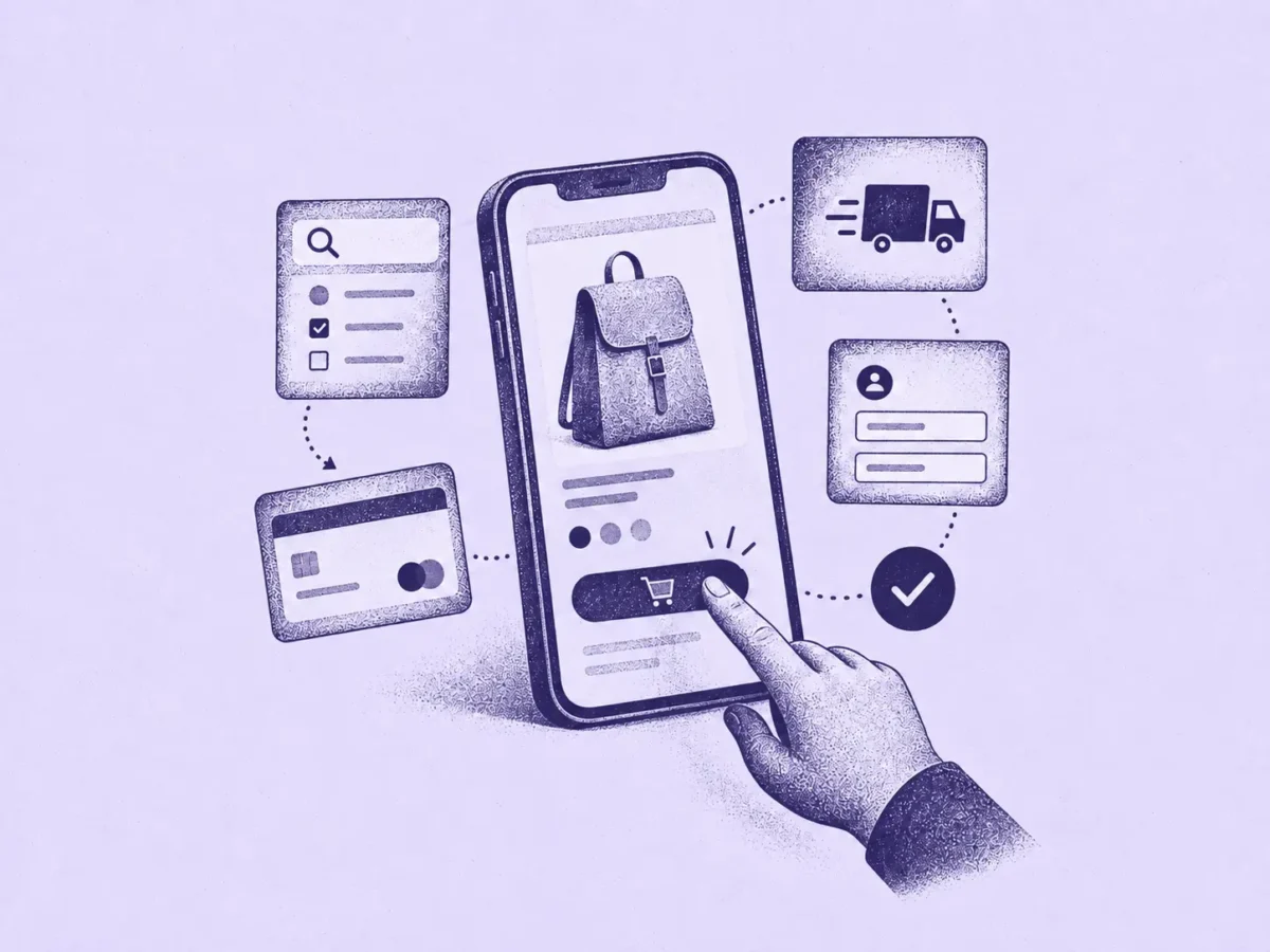
Mobile ecommerce conversion lags behind desktop due to several distinct, often overlooked issues rather than one single cause. Key factors include site speed measured through Core Web Vitals (LCP, INP, CLS), appropriately sized tap targets following WCAG 2.2 and platform guidelines, and legible text without requiring pinch-zoom.
Additional recommendations include testing on real, slower phones rather than desktop emulators, offering one-tap payment options like Apple Pay or Google Pay early in the shopping flow to reduce typing friction, and addressing mobile-specific design needs for image galleries, filters, and delivery information. A simple mobile checklist is provided to help identify the most critical issues affecting product page performance.
Most ecommerce traffic now arrives on a phone. Mobile still converts at a noticeably lower rate than desktop across the industry. That gap is not one problem. “Mobile-friendly” is really a dozen small, separate decisions. Most mobile ecommerce guides mention all of them and explain none of them properly.
This one focuses on the decisions that don’t already have their own article on this site. Where something has already been covered in depth, we link to it here rather than repeat a shorter, weaker version.
Fix Speed Before Any Design Decision
A beautifully designed page that takes six seconds to load loses the customer before they see the design. Google measures this through three Core Web Vitals. As of 2026, the thresholds are:
- LCP (Largest Contentful Paint) – under 2.5 seconds to count as “good”
- INP (Interaction to Next Paint) – under 200 milliseconds for the slowest tap or click on the page
- CLS (Cumulative Layout Shift) – under 0.1, meaning the layout barely moves after it loads
All three are measured at the 75th percentile of real Chrome users, not a lab test on a fast office connection. Google singles out transactional pages for stricter scrutiny than a blog post. Product listings, carts, and checkout all fall into that stricter category, because a slow product page costs a sale directly.
Check your own numbers in Search Console’s Core Web Vitals report before changing anything else here. A site failing LCP on its product pages is losing customers before any other mobile decision gets a chance to matter. The report groups pages by template, so a single fix to the product-page layout usually clears the failure across every product at once, not one page at a time.
Design for the Real Minimum, Then Go Further
WCAG 2.2 set a new legal-minimum tap target size in 2022. It is smaller than most teams assume “accessible” means:
- 24×24px – WCAG 2.2 Level AA, the baseline minimum
- 44×44px – WCAG 2.2 Level AAA, and Apple’s own Human Interface Guidelines
- 48×48px – Google’s Material Design recommendation, the most generous of the three
Build to the 44 to 48px range for anything a thumb needs to hit reliably. Add to Cart, quantity steppers, filter close buttons, and size selectors all belong in that range. The 24px legal floor exists to catch the worst offenders, tiny icon-only controls and cramped filter chips. It was never meant to set the bar for a checkout button.
Let the Rest Stay Where It Already Lives
A few mobile-specific decisions already have a full breakdown elsewhere on this site. Repeating them here in a shorter form would only weaken both articles:
- Image galleries need swipe gestures and real thumbnails, not shrunk desktop carousels.
- Filters need their own mobile design, not the full desktop list squeezed into a drawer.
- Delivery information needs to fit near the price without pushing the Add to Cart button off the first screen.
If mobile traffic on your store is underperforming, audit those three before assuming the fix is something new.
Remove the Typing, Not Just the Form Fields
The single biggest mobile checkout friction is a card number entered on a touchscreen keyboard. Every extra field is a chance to mistype on a small screen. Every mistype is a chance to give up.
Apple Pay, Google Pay, and other one-tap wallets remove the typing entirely. No card number, no expiry, no address, just a biometric confirmation. This matters more on mobile than on desktop, because the friction it removes is exactly the friction a touchscreen makes worse. Offer the wallet button early, on the product page and the cart. Don’t bury it as the last option on the final checkout screen.
The gain isn’t only conversion. Card details typed on a public train or in a queue get typed carelessly, which is part of why manual card entry produces more errors and declined transactions than a single biometric tap. Fewer typed digits means fewer chances to get one wrong.
Keep Text Legible Without Forcing a Pinch-Zoom
A font size that reads fine on a laptop can be unreadable on a phone. A customer who has to zoom in to read the price is one step from giving up entirely.
Set a real viewport meta tag. Size body text no smaller than 16px. Test the actual rendered page on a phone, rather than trusting how it looks scaled down in a desktop browser’s device toolbar. A desktop preview of “mobile view” hides problems that only show up on real hardware.
Test on the Slowest Real Phone You Own
Chrome DevTools’ mobile emulator runs on your development machine’s fast processor and fast connection. It will never show you what a three-year-old Android phone on patchy 4G actually experiences. That gap is exactly where most real mobile problems hide.
Google’s own Core Web Vitals data comes from real Chrome users in the field, called CrUX, not lab simulations, for this exact reason. Borrow the oldest phone in the office. Put it on a throttled connection. Load your own product page before trusting a lab score. A page that scores well in a controlled lab test and still feels slow in your own hand is telling you the lab test missed something the field data would have caught.
Run a Mobile Check
Open your own product page on a real phone, not a desktop browser’s mobile preview.
- Did the page feel fast, not just look fine, on your last emulator run?
- Can you tap “Add to Cart” reliably with a thumb, without missing?
- Can you read the price without pinch-zooming?
- Is there a one-tap payment option before you reach the final checkout field?
- Did the layout stay still while the page loaded, or did anything jump?
A “no” on the first two matters most. Everything else on a mobile product page depends on the customer staying on it long enough to see it.
Sources and further reading
- Google Search Central: Core Web Vitals
- W3C: WCAG 2.2, Success Criterion 2.5.8 Target Size (Minimum)
- Chrome User Experience Report (CrUX)