
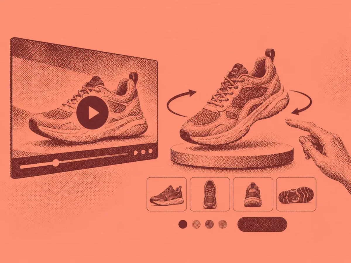
Product videos and 360° views should only be used when they reveal something static images cannot, such as motion, mechanisms, or fit. Research cited shows many shoppers skip video entirely, so placement, thumbnails, fast loading, silent autoplay with captions, and useful player controls determine whether the content gets watched at all.
The guide recommends prioritizing demonstrations over cinematic marketing footage, reserving 360° views for products where shape or craftsmanship matters, and using GIFs for simple looping visuals. It closes with a quick sound-off test to check whether existing video content actually performs these functions effectively.
A product video only earns its place if it shows something a photo cannot: fabric moving, a mechanism folding open, a shoe flexing underfoot, a sound a speaker actually makes. Static images already have a ceiling. Video and 360° views exist to answer what sits above it.
That does not make either one mandatory, or a replacement for a strong image gallery. It makes them a specific tool for a specific gap, worth using where they close it and worth skipping where they do not. Most of the mistakes on this page are not about production value. They are about where the video sits, whether it loads before patience runs out, and whether it says anything the images had not already said.
Show motion a photo cannot, or skip it
Baymard’s product page testing found that 41% of users watched product videos when one was available, while the other 59% skipped straight past even after spending real time on the images. (baymard.com) That is a meaningful minority actively choosing video, not a majority you can assume will click play, so the content has to justify itself rather than simply exist.
A video that just re-films the gallery’s own angles gives the 59% no reason to change their mind, and wastes the attention of the 41% who did press play expecting something new.
Put it exactly where people are already looking
Video only works if it sits inside the same thumbnail row as the product images, with its own thumbnail carrying an unmistakable play icon.
Baymard’s research on video placement found that 35% of major ecommerce sites tuck their videos somewhere unexpected, far down the page or inside a separate tab, and that placement alone was enough to stop people finding content they were actively looking for. (baymard.com) A small triangle in the corner is not enough. A shopper scanning the row should know which thumbnail plays before they tap anything.
Give the video a reason to be watched before it plays
A descriptive title, a short line of context, and a start frame worth pausing on do more for watch rate than almost anything inside the video itself, because they help someone decide whether to invest the ten seconds before they have committed to it.
A thumbnail labelled only “Video” or left on whatever frame autoplay happened to land on gives a shopper nothing to judge. “See it fold flat in 15 seconds” gives them a reason.
Default to silent
Play video without sound, and make the mute control obvious the moment it starts. Autoplay with sound is one of the few things that reliably annoys a shopper at a desk, on a train, and next to a sleeping baby, all at once.
Do not put anything essential only in the voiceover. Most people watch muted, especially in public, so captions or on-screen text need to carry whatever a narrator would otherwise say out loud.
Load it fast, or lose the moment you were given
A customer who taps play has already decided to spend ten more seconds on your product. A slow-loading video spends that goodwill on a spinner instead of the content it was supposed to deliver.
| Load time | What happens |
|---|---|
| Under 10 seconds | Matches what people expect from any video service |
| 10 to 20 seconds | Tolerated, but attention starts to drift |
| Over 20 seconds | Most viewers are already gone |
Host on a CDN built for video delivery. A slow product video does not just fail to help, it spends trust the page had already earned.
Give the player controls worth having
Add scrubbing previews, a strip of small thumbnails along the timeline, so a customer chasing one specific answer, does this zip catch on the fabric, how loud is this blender, can jump straight there instead of rewatching the intro.
Fixed-increment rewind and fast-forward help the same way. And the video needs to enlarge properly. A product video pinned at postage-stamp size defeats the entire point of shooting it.
Keep it useful, not just cinematic
Shoppers consistently push back on videos that are all flash and no substance, moody, marketing-led pieces that never actually show a feature working. A straightforward demonstration of a zip, a hinge, or a fit tends to beat a lifestyle montage when it comes down to a purchase decision.
For genuinely complex products, a short educational video earns its place too: how to measure for the right size, how to apply a product correctly, how a multi-part item goes together. Some shoppers dismiss this kind of content as basic. Plenty of others find it reassuring, precisely because it lowers the risk of buying something they will end up returning, and a lower return rate is worth more to the business than a slicker reel.
Offer 360° only where the shape itself is the sell
A 360° view answers a narrower question than video does: what does this look like from every angle, under my own control, right now. It earns its place on products where shape or craftsmanship from an unexpected angle is genuinely part of the pitch, furniture, watches, shoes, anything with visible stitching or joinery.
Baymard’s benchmarking found that 83% of users did not attempt to use a 360° feature even on product pages that offered one. (baymard.com) Combined with how rarely sites offer it at all, that points at the same lesson as video: build it where it adds something real, not as a checkbox on every listing.
Reach for a GIF when video is overkill
A short, silent loop, a zip closing, fabric catching a breeze, a colour shifting in the light, does not need a full video player. It plays automatically, asks nothing of the viewer, and gets watched precisely because it demands no decision.
Save the full player for content that actually benefits from narration, scrubbing, or more than a few seconds of runtime.
Run a thirty-second sound-off check
Mute your speakers, open a product page on your phone, and tap play on the video.
- Did you understand what it showed without sound?
- Did it load before your patience ran out?
- Could you tell it was a video before tapping it?
- Did it show you anything the still images had not already?
- If there is a 360° view, did you find it without being told it existed?
Anything you answer no to is the fix that matters more than shooting new footage.
Product video and 360° views are not a substitute for a strong image gallery, they are what a customer reaches for once the gallery has already done most of the convincing. If that gallery still needs work, the same audit logic applies there. The same goes for price clarity: it either answers the customer’s question immediately or it does not.