
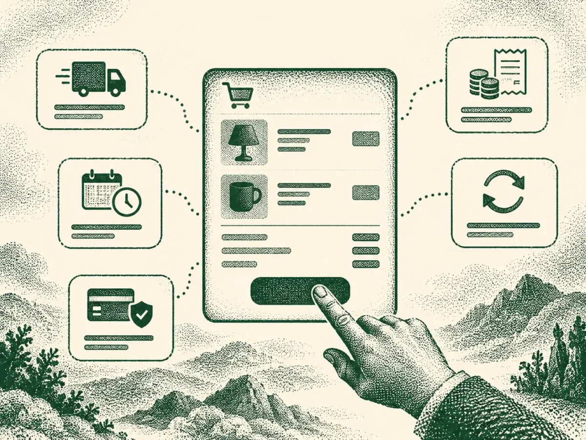
The content addresses why shoppers abandon online carts, citing research showing that late-appearing costs, forced account creation, and vague delivery estimates are leading fixable causes. It argues that carts should display final totals, delivery dates, and return terms before checkout begins, rather than revealing them during the process.
The piece offers specific recommendations: show fully calculated totals without requiring account creation, provide address-specific delivery dates rather than vague ranges, update estimates instantly when details change, and state explicit return windows and shipping cost responsibility directly in the cart. It concludes with a self-check exercise for site owners to test whether their own cart surfaces this information early enough.
About seven in ten online shopping carts get abandoned before checkout, and Baymard’s research puts the single biggest reason at extra costs showing up too late: 39% of shoppers who abandon for a fixable reason point to shipping, tax, or fees appearing at checkout that were not visible before. (baymard.com) That one number is worth sitting with. It is not that shoppers refuse to pay for shipping, most expect to. It is that the number changed after they had already mentally agreed to a different one.
Good checkout page design settles the final price, the delivery date, and the return terms before the customer ever clicks through to checkout, not during it. Nothing on that list needs to be a surprise, and every surprise on it costs a sale.
Show the real total before checkout starts
The cart should show exactly what a customer will pay, shipping and tax included, before they click through to checkout. Baymard’s checkout research found that 39% of users who abandon for a fixable reason do so because extra costs appeared too late to feel like part of the deal they had agreed to. (baymard.com)
A customer who mentally commits to one number and then sees a higher one at the final step does not experience that as a normal shipping charge. It reads as the price changing on them at the worst possible moment, and the sale is usually gone before anyone on the team even knows it happened. This holds even when the added cost is small. A five-dollar shipping fee that appears out of nowhere does more damage to trust than a fifteen-dollar fee that was visible from the first screen, because the size of the surprise matters less than the fact that it was a surprise at all.
Don’t hide the total behind a forced account
If a customer cannot see their real total without creating an account first, the cart has put the one number that matters most behind a barrier most people resent. Nineteen percent of fixable checkout abandonment traces directly to forced account creation, and that sits on top of anyone who left earlier simply because the total stayed a mystery for too long. (baymard.com)
Let guest checkout show the same fully calculated total a logged-in customer would see. Account creation can still be offered, ideally after the order is placed, rather than as the price of finding out what the order actually costs.
Give a delivery estimate that means something
A delivery window belongs in the cart itself, calculated for the customer’s actual address, not buried until the final review screen. Baymard’s research found that 21% of fixable checkout abandonment comes down to delivery feeling too slow, and a real share of that is about timing arriving too late to plan around, not the delivery itself being unacceptable. (baymard.com)
“Delivery in 3 to 5 business days” tells a customer less than “Arrives by Thursday, 14 March” does. The second version lets someone actually decide whether that works for them, which is the entire point of showing it at all. A range also invites the worst-case reading by default: most people plan around the longer end of “3 to 5 days” anyway, so a vague window earns none of the credit it could have for genuinely fast delivery.
Where a site offers several shipping speeds, each option needs its own estimate rather than one number for the whole list. A customer comparing standard against express cannot make that trade-off if only the cheapest option shows a date and the rest just say “faster.”
Update the estimate the moment anything changes
The delivery date and the running total both need to move the instant a customer changes address, shipping method, or quantity, not settle into their final, accurate form only once checkout has already started. A stale estimate corrected two screens later reads as a bait-and-switch even when nobody intended it as one.
This matters most exactly where people are already primed to expect a catch: shipping to a different country, choosing a faster delivery option, or adding a second item that pushes the order past a free-shipping threshold.
Put the returns policy where a customer can actually find it
Return terms belong next to the price and the delivery estimate, not tucked away on a separate policy page someone has to go hunting for. A shopper deciding whether to buy is already silently asking what happens if this does not work out, and an easy answer sitting right there in the cart removes one more reason to hesitate before paying.
The two details people actually check are the length of the return window and who pays for return shipping. Bury those inside a long policy document and most customers will assume the worst version of both rather than read far enough to find out otherwise. This is especially true for categories where fit or suitability is uncertain, clothing, furniture, anything ordered without seeing it first, since the return policy is doing part of the job a physical shop’s try-before-you-buy would normally do.
Don’t let the one detail that worries people stay vague
A returns line that just says “See our returns policy” answers nothing at the exact moment it matters. State the number of days directly, and say plainly whether return shipping is free or comes out of the customer’s own pocket, right there in the cart summary.
It is a small amount of text carrying a disproportionate share of the customer’s confidence. Getting it right costs nothing to implement and targets the exact hesitation a generic policy link cannot reach.
Run a one-cart check
Add something to a cart on your own site and stop before clicking through to checkout.
- Do you know the exact total, including shipping and tax?
- Do you know when the order will actually arrive?
- Do you know the return window and who pays for return shipping?
- Did you have to create an account to find any of that out?
- Would anything change if you switched shipping address or quantity right now?
A “no”, or an “I’m not sure,” anywhere on that list is the surprise a customer would otherwise have hit one step later, at the exact moment they were ready to pay, and the exact moment losing them costs the most.
None of this is about redesigning checkout. It is about moving three answers earlier on the page than most sites currently put them. The same logic runs through the rest of the product experience: filters that don’t force someone to learn your taxonomy, images that answer real questions before a customer scrolls to the description, and a cart that tells the truth before it ever asks for a card number.